Power BI governance may not capture the imagination when creating a data strategy, but it’s vital for several key reasons:
- Governance improves data security by preventing unauthorized access to sensitive information and avoiding data breaches.
- Governance helps organizations comply with industry regulations and data privacy laws – reducing legal liabilities.
- Governance maintains data quality and accuracy through standardized processes and validations.
- Governance optimizes cost management by efficiently allocating resources and licenses.
Moreover, Power BI governance facilitates collaboration, communication, and performance by establishing guidelines for sharing and teamwork. Additionally, it mitigates risks, offers centralized management, and aligns Power BI usage with business objectives – enhancing informed decision-making and overall efficiency. [Click here to get your free copy of our Power BI Governance Primer]
In this guide, our data experts break down Power BI Governance into five key sections:
- Delivery Strategy and Licensing
- Sharing and Deploying Content
- Report Design Strategy
- Data Gateway Management
- Refining and Maintaining Your Strategy
To simplify your experience, feel free to click on any section to jump to that content.
Power BI Delivery Strategy and Licensing
This section provides a high-level checklist of things to consider when forming your future Power BI strategy. Following it will help ensure you are covering the most important considerations. And what better place to start than with delivery strategy?
Delivery Strategy
When implementing Power BI, it’s important to understand the different delivery strategies available. Figuring out which strategy best fits your organization can help answer questions like what licensing you need and how your data needs to be organized. Your options include business-led self-service, IT-managed self-service, and corporate BI. Any organization may fall on a spectrum between these three general delivery strategies.
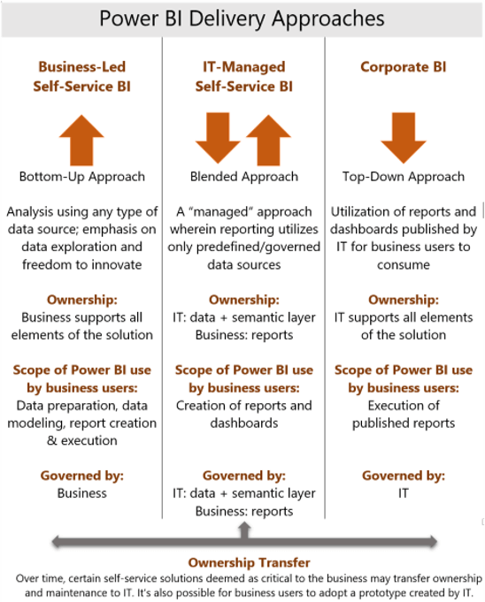
Business-Led Self-Service
Business-led self-service is a bottom-up approach, meaning that the business units in your organization are completely self-sufficient with analytics. They take ownership of the data preparation, integration, data modeling, report creation, and execution. As shown in the chart, BI ownership and governance are completely managed by the separate business units in this delivery strategy.
It’s rare to see a completely business-led self-service BI model in an organization. Business-led self-service BI models require a mature analytics environment because business units are required to source data themselves. In that situation, each business unit would need skillsets like business analysts, data modeling, and even integration skills to transform the data into a format that can be used for reporting and analytics.
A completely business-led self-service BI model requires a lot of resources. This delivery strategy is often used at very large companies because they can have those skillsets in each business area. That’s why IT-managed self-service BI delivery is much more common.
IT-Managed Self-Service
In our experience, IT-managed self-service is the most common approach. It’s a hybrid between business-led self-service strategies and the corporate BI strategy.
In this strategy, the IT department (or your BI department within IT) is responsible for data preparation, integration, and making the data available to the business so they can report on it. The different business units are responsible for the creation of those reports and dashboards in a tool like Power BI. In short, the data ownership is on the IT side while report governance and management ownership belong to the business side (or to each of the business units).
IT-managed self-service reduces the integration and data modeling skillsets needed in your business units. The business mostly needs analysts who can learn the Power BI Desktop application and become proficient at making reports and visualizations from datasets made available to them from IT.
Corporate BI
Corporate BI is more of a top-down approach and the opposite of business-led self-service. In a corporate BI delivery strategy, all your BI reporting and data is managed by the IT department. They own all elements of reporting and data management – including data preparation, integration, and availability. They also own the creation and publication of reports and dashboards – as well as sharing them with appropriate groups. The Corporate BI delivery strategy isn’t as common and has some limitations regarding flexibility in providing business units with the data and reports they need in a timely fashion.
Which Delivery Strategy Is Right for My Organization?
It’s important to know which strategy you’re going to pick when implementing and deploying Power BI in your organization. How can you determine which of the three strategies (or what mix of strategies) works best? It’s crucial to be realistic with the resources you have. If your organization has a very small IT team or limited data preparation experience, it will limit your delivery strategy options. You need to consider the data culture within your organization and how willing different departments are to provide the analytical skills required to support a self-service IT approach. Finally, you need to evaluate your data architecture and determine if it is scalable enough to support a self-serviced IT approach.
Licensing
How does your delivery strategy affect licensing? The way you share data, the people who prepare it, and how engaged your organization is with BI will change what licensing you need. We’re not going to talk about pricing, but we will focus on some high-level features. Whether you start with the free licensing or jump directly to Pro or Premium levels, Power BI can offer a lot of advantages.
Free
It’s free to start out with Power BI. You can download the Power BI Desktop application and start authoring reports. You can then publish those reports to the service where you have a free My Workspace area. This is a great place to start if your organization is on the fence about using Power BI. New users can also opt-in to a free Power BI pro license trial for 60 days to test some of the sharing and collaboration features offered in the Power BI service.
Pro
Pro licensing is the next level, and it’s needed to share content within your organizational workspaces and apps in the Power BI service. Pro licensing starts out at $10 per user per month, but it can offer good value when you want a level of BI collaboration you can’t get with just the free option.
Premium
While one or two Pro licenses may be enough for smaller organizations, that may not be enough for a larger enterprise. If an organization wants to scale Power BI to hundreds (or even thousands) of users in their organization, then they should consider Power BI Premium because it enables the sharing of content through Power BI apps with Power BI free users.
With Premium licensing, you need to pay the set SKU price of a Premium node. There are three tiers of Premium pricing, but (depending on your needs) it can be worth it. With the Premium licensing level, you get several features that are unavailable with the Pro licensing. You also get the built-in functionality of being able to embed Power BI content in a custom application or website (for example).
While both embedding and paginated reporting are included in Premium licensing, you can also buy them separately. Power BI Report Server is included for free if you have SQL enterprise licensing, but you can also purchase it separately if you are not using Power BI Premium.
Premium Per User
Premium per user is a licensing option that provides individual users access to the advanced features of Power BI Premium without the organizational license. This option is a cost-effective way to obtain all the capabilities of Power BI Pro with the additional premium features such as dataflows, AI-powered visuals, high-powered data refresh, and large-scale data models. Power BI Premium Per User starts at $20 per user per month.
The Evolving Licensing Landscape (Advantages of Premium Features)
Previously, organizations would start with “How many users do I have?”, and the answer decided whether to choose Power BI Pro or Premium.
If you had X number of Power BI users, you wanted to stay under that 500-user amount because 500 users multiplied by $10 is roughly $5,000 a month – which equals the lowest tier of Power BI Premium. However, with the number of features that are getting released at the Premium SKU level, you may want to think about not just the number of users in your organization but also the value of some of those features.
So, what kind of features are we seeing released in 2023 for Power BI Premium and in the future roadmap of Power BI? Some highlights include AI infused insights, increased integration with Microsoft Office, and self-service data prep. Existing premium features that are worth consideration are deployment pipelines and XMLA endpoints. These features (along with others) may be a reason for your organization to look at the value of premium and premium per user licenses.
Sharing and Deploying Power BI Content
In this section, we dig into the question, “How do you want to design the way your organization shares content, and what are the different ways to do that within Power BI?”
Apps
Apps are the preferred method of sharing Power BI content. Apps are used within the Power BI service to share content from published workspace content. These apps can include dataflows, datasets, reports, paginated reports, Excel workbooks, and dashboards. Apps can be used with Power BI pro or premium licensing.
Workspaces
After you develop reports in the Power BI Desktop app, you can publish them to workspaces. That’s where they sit until you either enable content in apps or share reports individually. We have several guidelines for organizations to follow when setting up workspaces in the Power BI service.
Separate Report and Dataset Files
If you’re familiar with building reports in the Power BI Desktop app, then you know the file format of a PBIX file can hold the data model (or dataset) of the report and all the visual content on your report pages. We recommend having separate PBIX files: one for just the data model or dataset that you create, and then another for the report side – including report pages and visualizations.
The reason for dividing the report and dataset files is that it encourages dataset re-use within your organization. Using shared datasets is a much more efficient way to share content than having users create dataset redundancy within the organization. It also creates a more convenient setup where dataset files are managed like Analysis services data models and the report files are left to handle the visualization and cosmetic side of the Power BI report.
Dividing Environments
Working with different customers and clients, we’ve seen several ways organizations have divided and named their environments – including a three-environment approach or two-environment approach.
The standard approach is to have three environments: development, test, and production. This is recommended for organizations using deployment pipelines with Power BI Premium. With deployment pipelines, you get automated development, testing, and production workspaces created for you with the pipeline (so it makes a lot of sense to go that route). Having those three environments also keeps things standardized from a development strategy standpoint. We’ve also seen organizations use just two areas: a sandbox or a test area, and then a production type workspace.
The environment approach you choose will largely depend on how you’re deploying content and how many resources you have to manage the content. You need resources to migrate reports through the environments you choose, and (with the three-environment approach) that means one extra environment to manage.
Divide Workspaces by Business Content
Typically, we recommend dividing out workspaces by business content. Similarly, business subject matter is going to determine what designates a workspace area. Keep these groupings broad enough to encompass multiple sets of data. You don’t want to create a workspace for every single individual report or dataset. That’s not very efficient. You want to group by business content or business units like sales, finance, manufacturing, purchasing, or other common business areas.
You may also divide workspaces by specific security groupings. You may do it for a security standpoint of, “I have these 10 users that may work in different departments, but they view the same types of content and data.” It may make sense to group those individuals in a workspace, such as an executive team or a management group in a different business unit.
Divide Dataflows and Datasets
If you’re utilizing dataflows within Power BI, consider dividing dataflows and datasets into different workspaces. Refer to this documentation for more recommended best practices on dataflows.
Use Security Groups for Apps and Workspaces
It is strongly encouraged to use security groups, not only for app distribution but also for workspaces. It’s important to note that, in order to do that within workspaces, you need to be using the version 2 workspace experience instead of the legacy or version 1 experience.
If you’re using version 2 workspaces, there are two additional roles compared to the version 1 experience. Make sure you understand what access each workspace role gives users.
Standard Naming Convention
Whether you allow only certain people to create workspaces in your organization, or if you open that up to a larger group of people, make sure you standardize your naming convention. Keeping things more consistent makes it easier from a management standpoint. It also makes it a lot easier to consume that information when workspaces are similarly named.
Avoid Content Packs
Try to avoid using content packs because they are the legacy way of sharing Power BI content that apps have replaced. If your organization is still using content packs, you may want to seriously consider a migration strategy over to apps.
Row-Level Security
Row-level security may be an option for sharing content with a larger group of end users that only have access to certain rows or columns of your dataset. A common example of this is a sales team. The entire team may have access to the same broad categories of data, but each salesperson only needs to see information for their territory, region, or set of customers.
Implementing row-level security through Power BI datasets or Analysis Services will allow you to create a broader dataset you can distribute to a larger audience: in this case, the entire sales team. Then, when an individual salesperson logs into the Power BI report, you can enable a filter to restrict that salesperson to seeing only their data. Restricting that access, while still maintaining the broader dataset, can save you hours of management time. Instead of creating multiple datasets for your sales reports, you can use one dataset with row-level security.
Embedding Reports and “Shared with Me” Option
There are two final ways to share your Power BI information. By purchasing a SKU or upgrading to Power BI Premium, you can embed reports in a website or custom application. This can be useful for sharing content with a larger audience and not needing Power BI pro licensing for each user viewing the report.
Finally, a one-off technique that we don’t recommend – but can be used in certain situations – is the “Shared with me” option. You have an entirely separate menu for this in the Power BI service within the navigation menu. It allows you to share reports or dashboards with certain individuals or groups instead of using an app to do that. This option does require everyone to have a Power BI pro license even if you are using Power BI premium.
Deploying Content
Now that we’ve covered the sharing options available to you with Power BI, let’s dig into some of the best practices for deploying content because this can be a pain point for organizations already using Power BI.
Source Control
Currently, Power BI does not have a great solution for managing your PBIX or desktop files. For the Power BI space, there isn’t a standard source control environment that can be deployed throughout different environments.
They are getting closer to that, though. With a couple of recent feature releases, they’re starting to bridge the gap between what you would consider standard source control integration and what’s currently available for Power BI. These features include the enhanced metadata preview in Power BI Desktop, along with deployment pipelines for Power BI Premium users.
To get around the lack of source control options in the interim, we utilize a OneDrive workspace or a OneDrive folder area within a team SharePoint site. That area used to be automatically generated in the version 1 workspace experience. But since that’s turned off in the new workspace experience, this may be an additional step for those of you migrating to (or exclusively using) version 2 workspaces.
Another option is using a Git repository. Even though there is not a great way to do schema compare, like you could with a database project or a tabular model in Analysis Services, you still can hold your Power BI report files in a Git repository, along with your other database or data model artifacts.
Other Deployment Considerations
One thing we cannot stress enough is to utilize parameters in your Power BI Desktop files (this also includes utilizing templated files). Parameters can be used to easily migrate between your different development, test, and production environments.
Those parameters are best implemented with relational database-type data sources. You may have three separate servers for the same database in your dev, test, and prod environments. Parameterizing that server and database name in your desktop files easily allows for migration between those environments, instead of having to manage three separate report files.
With parameters, you’re only managing that one report file (or two report files if it’s a dataset and a report) and migrating that through the different environments. Having those parameters in your datasets also makes using deployment pipelines a lot easier.
There’s been some work around automated deployment strategies through Azure DevOps release pipelines. Unfortunately, that technique is currently somewhat of a manual workaround. It’s not nearly as automated as you may be used to with using Azure DevOps pipelines. We would consider this strategy a temporary workaround. Microsoft continues to bridge the gap from their current source control integration with Power BI to what you may be used to with standard software lifecycle management processes.
Power BI Report Design Strategy
After you have your dataset and workspace delivery strategies established, it’s a good time to focus on creating reusable, consistently branded, and well laid-out reports. These reports should have a user-friendly design and supporting documentation. Your design strategy can greatly impact your end user report experience and impact the amount of time needed to manage your reports.
In this section, we will take a high-level look at what you can strive for within your organization. Your goal should be to develop a set of report design best practices within your IT department and different business units. Ultimately, you want to ensure that the resources you develop in this report design strategy are made available in your Center of Excellence and to your end users for re-use and guidance when building Power BI reports
Develop Re-Usability
In developing your Power BI report design strategy, we highly recommend focusing on re-usability – including templated files, brand standards, and background layouts. PBIT file templates can save you a lot of time because they save your data source connection details, theming, and your report page layouts. Templates are a great way to give your end users a head start when creating reports.
Consistent Branding and Themes
When designing re-usable Power BI reports, it’s important to create a consistent branding strategy. Using the theme builder in Power BI desktop lets you align a color palette to your organization’s brand standards and keeps a consistent look and feel with your visual settings. Creating a theme file(s) should create consistent branding that can be used across reports in your organization.
Templated Backgrounds
Creating templated backgrounds can save report creation time and improve the user experience. You can create your background design within PowerPoint, save that background as an image file, and then upload it into Power BI Desktop. Then you can use that background repeatedly as a template in future reports. A great blog post by Chris Hamill on creating Power BI backgrounds in PowerPoint can be found here.
Additionally, Power BI is continuing to add PowerPoint features (like the shadow feature) into the Power BI Desktop tool. We believe Microsoft is just getting started integrating the PowerPoint design capabilities with Power BI Desktop.
Report Best-Practices Related to Layout
Ideally, you want a standardized layout for your reports. All your report pages do not need to look the same (your dataset and business requirements will ultimately decide your visualization choices), but some things to think about include titles, KPI card layout, and limiting slicers.
Titles
We’re a big fan of using titles in our report pages – so long as the titles aren’t long and don’t have a large font size. Report real estate is limited, so it’s vital to prioritize the visualizations and data that will tell the story that you’re trying to convey to your end users. However, having a distinct title in the upper left-hand corner of your report page tells users what data they’re looking at right away when consuming your report.
KPI Card Layout
For titles and KPI card layout, create a best practice that works for you and your organization. We’ve had success with always putting KPIs at the top or left-hand side of a report page and then limiting slicers.
Limiting Slicers
When we’re leading Power BI trainings, we often tell attendees, “Limit your slicers on a page to four or five at most.” The rest of the attributes you want to slice by can go in the filter pane or be accessible via the interactive filtering within the Power BI report visuals. Keep those features in mind in your report design.
If you want to dig into report design a little more, we recommend this great report design guideline produced by Miguel Myers. He’s a member of one of the Power BI teams at Microsoft.
Include Supporting Documentation
Ultimately the data model is most important in your Power BI report design. But it’s important to realize that even if you have a well dimensionally modeled dataset, you need to visualize the data and be able tell a story to your end users. While visualization selection is important, there’s one more item that shouldn’t be skipped: supporting documentation. It can often help end users consume your reports and help them gain actionable insights from your data. Below you will find a couple examples of useful supporting documentation you should create.
README Report Pages
Don’t be afraid to include README-type report pages. They can be hidden or incorporated via tooltips and buttons, so they don’t take up much space in your report pages. This type of documentation could be the starting pages in your report that a user reads before diving into the meat and potatoes of your data and visualizations. A great example of this type of documentation can be seen in this Power BI report example.
Documentation Links
Another way you can include documentation is through app links. Within the new app navigation experience, you can include documentation links. Example of documentation you can link in an app would be a SharePoint page or a file saved on a Teams site. Those resources can be used to include a more detailed explanation of how your report pages are configured.
Other Usability Features
Tooltips to Explain Report Features
Whether you’re using tooltips in a page or a button, you can include messages that will pop up on your screen when you hover over them. Often, that sentence or two of clarification can help a user understand what your visual is communicating. Tooltips can also be used to call out the different features that are available in that visual, like drill-through filtering. Chris Hamill provides a great example on how to do this in this blog post.
Disable Unused Visual Header Icons
The new visual header experience in Power BI desktop provides a lot of options for formatting and exploring your visualizations. Enabling all these options can cause confusion for end users. It’s important to disable visual header icons not used or are not relevant in the visual. Microsoft has released several new options in the visual header section that you should consider disabling if you’re not actually using them. Developing a set of best practices in your organization around report design will allow for you and your end users to create consistent and re-usable reports.
Data Gateway Management
An on-premises data gateway is only needed for organizations using on-premises data sources. If you’re using all cloud data sources, then this step isn’t needed for your implementation and simplifies your Power BI architecture.
However, for those of you using on-premises data sources, a data gateway is required for your Power BI service architecture. To help you understand what to do, let’s dive into some guidelines when configuring your on-premises gateway(s). [Learn more about our data solutions]
One Gateway Per Server
Setting up a data gateway is only needed for on-premises data sources. Additionally, only one data gateway can be installed per server. Here is a link to download the latest Power BI data gateway.
Use Service Accounts
Ensure you are using service accounts with the appropriate permissions for authentication in your data source connections. Don’t use personal accounts, due to password expiration or an employee leaving your organization. If passwords expire and you haven’t replaced them in the gateway connection, then your data sources will be offline. This may lead to end user frustration with Power BI reports being unavailable.
Consider Clustering Data Gateways
Clustering data gateways means you can install one data gateway and then install another data gateway and attach it (or cluster it) to the existing data gateway. We have some use cases for this below.
Dev/Test/Prod Data Separation
One option for your gateway setup is to have a single gateway for your dev data source connections, your test, or your prod data sources. Similar to how we recommended setting up your workspace environments with a dev/test/prod distinction, consider setting up your data gateway cluster in a similar configuration.
Divide by Type (Like DirectQuery vs Import)
You may want to set up your cluster based on the type of data source connections you’re using (like DirectQuery vs. import data source connections). You may want to consider putting all your imported dataset connections on one cluster. For your DirectQuery data source connections, you will want those connections to sit on a separate data gateway.
Why? Because DirectQuery datasets require more CPU for those native queries back to your data source. Import datasets will require more memory (RAM) resources on that gateway server.
Do Not Allow Personal Data Gateways
It’s possible to install personal gateways. That’s often for users testing out Power BI in their personal workspace in the Power BI service. It is highly recommended to not allow personal gateway installation to avoid confusion with end users configuring their dataset refreshes in the Power BI service.
When end users publish their reports to the service, they will often connect to their personal gateway by default if it’s installed. You want end users connecting their reports to the data sources set up in the on-premises gateways that are managed by your IT department.
Have a Strategy for Monthly Gateway Updates
Just like with Power BI Desktop, the data gateway comes out with monthly updates. It’s important to stay up to date on those. Create a strategy for who’s going to make those updates and how the data gateway will get updated.
Designate Gateway Administrators
Finally, designate the appropriate gateway admins in your organization. Put the right people in charge of your data gateway: those who have the permissions and access to shared credentials. Oftentimes, that may be certain people in the IT department, or maybe certain power users within your organization.
If you have more questions about effective data gateway setup, feel free to contact us. We are always happy to help.
Refining and Maintaining Your Power BI Strategy
Sharing content, report design, workspace and app setup are all vital to effective Power BI Governance (and have been covered in detail in this series). A delivery strategy for each of these areas is essential in your organization’s overall governance of Power BI. One final key element is a decision on how you’re going to monitor and performance-tune your existing content in your Power BI tenant.
To help you guide your Power BI strategy implementation, this section covers some monitoring strategies as well as guidelines on establishing a Center of Excellence.
Monitoring Methods
Analyze Power BI Adoption
You can retrieve information about Power BI adoption within your organization through the Power BI activity log or the Office 365 audit log by reviewing the Power BI REST APIs or PowerShell cmdlets. With this data, you can see which users are most active within workspaces or apps. You can also see which reports and dashboards they’re accessing the most.
Capture Power BI Metadata & Metrics
Similarly, you can understand your Power BI metadata and activity metrics from the data you obtain from those PowerShell cmdlets or APIs. This can be referred to as your Power BI inventory. You can use it to get answers to questions like:
- How many workspaces are set up?
- How many apps do we have?
- How many users do we share a workspace or app with?
- How many reports or datasets are in those workspaces or apps?
- Which Power BI objects are being used the most? The least?
We can’t stress enough how critical it is to have a solution in place around Power BI audit log extraction as a part of your overall Power BI governance plan.
Bonus: if you’re using Power BI Premium, there is a Capacity Metrics app that’s pre-created by Microsoft that you can download from the AppSource menu.
Performance Tuning
Once you have created your content, sometimes you’ll run into roadblocks with underperforming visualizations or queries, or datasets taking a long time to load and refresh. Below are some resources that can help you start tuning those datasets, DAX, and visualization queries.
- Vertipaq Analyzer
- DAX Studio (DMVs)
- PowerQuery diagnostics
- Taking advantage of query folding in PowerQuery
- Performance Analyzer
Center of Excellence
The culmination of every aspect of your Power BI governance strategy is in a Center of Excellence (COE). A Center of Excellence offers a cross-discipline space for people using and building Power BI content to learn, collaborate, share, and develop best practices for the organization. Unless you’re going to choose a pure corporate BI strategy, a COE is invaluable.
If you want to deploy Power BI in a self-service environment (whether that’s entirely business-led or a hybrid), a COE helps ensure you have a common area to share and collaborate with your resources and best practices. It’s also the ideal location to share standardized content that your business users can easily reuse.
To make the most of your COE, we recommend including community tools, training resources, and best practice guidelines for both content consumers and creators. It’s helpful to divide up your content by those who will be creating reports vs those who will be solely consuming those reports.
Community Resources
We strongly recommend including community resources like:
- Microsoft documentation
- Summaries of monthly desktop updates
- Links to helpful blogs, tips, videos, webinars, etc.
- Local user group information
Feel free to add any other resources to help your Power BI end users refine their skills, learn new skills, and improve your Power BI content.
Data for Consumers and Creators
In your COE, you should include information in two distinct categories: content creators and content consumers. That’s because you’ll often have one group creating Power BI reports and datasets, and another group will be exclusively consuming that content.
Content Consumers
Content consumers don’t need the same resources as creators. They may be heavily using apps and other Power BI service-only features, but they don’t need to know the ins and outs of data modeling and report creation. Point these users to resources that will help them easily access the features they need.
Content Creators
On the other hand, content creators should be pointed toward resources that increase their skills – like a Power BI report creation or a dimensional modeling training course. An idea to incentivize end users to take a training would be an exchange for a Power Pro license. For content creators, it’s also valuable to share tips and tricks about key Power BI topics. These may include:
- Data modeling techniques
- How to create a star schema data model (which is vital when building Power BI datasets)
- Dax and Power Query resources (because this technology is built off the Analysis Services engine for tabular modeling)
- Report creation technique and best practices (see our previous blog about report design strategy for key insights)
- Monthly office hours
- Backgrounds and templated files
- Theme files for Power BI
- Tips and tricks about dashboard creation, apps, workspaces, and how to distribute content within your Power BI tenant
Conclusion
In this guide, we’ve reviewed everything related to Power BI governance starting from your overall delivery strategy to how to refine and maintain that strategy with a Center of Excellence. If you have any questions about how to apply data strategy to your organization, contact us. We are happy to help.